
Xefer Twitter Visualization
This graphic can generally be put in the pile of visualizations of stuff that isn’t important, but the display is cool. This tool from Xefer looks at your Twitter behavior distribution over days of the week and time.
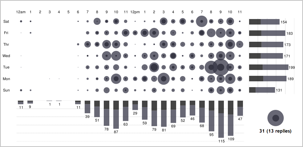
Happily, it seems I don’t use Twitter in my sleep.