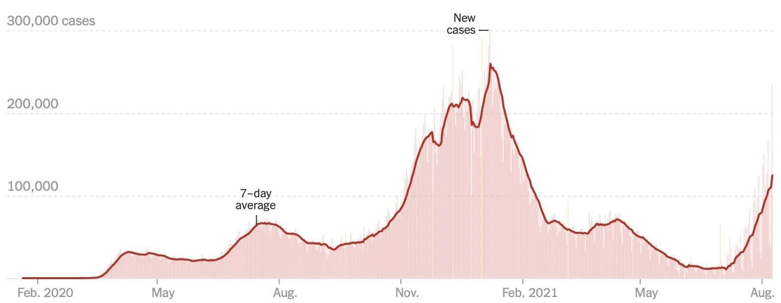
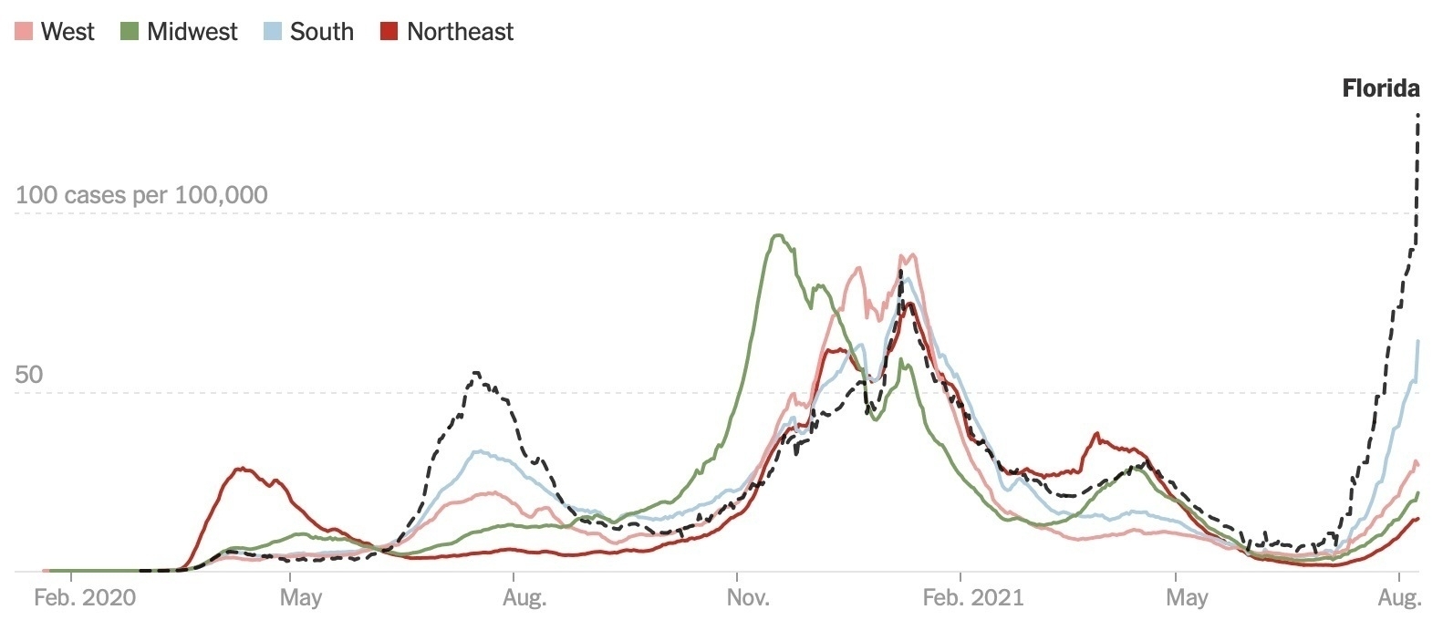
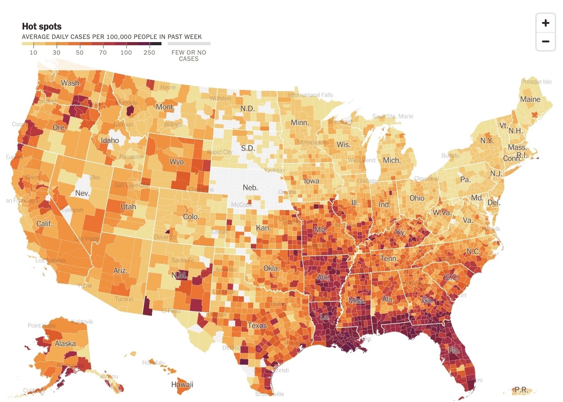
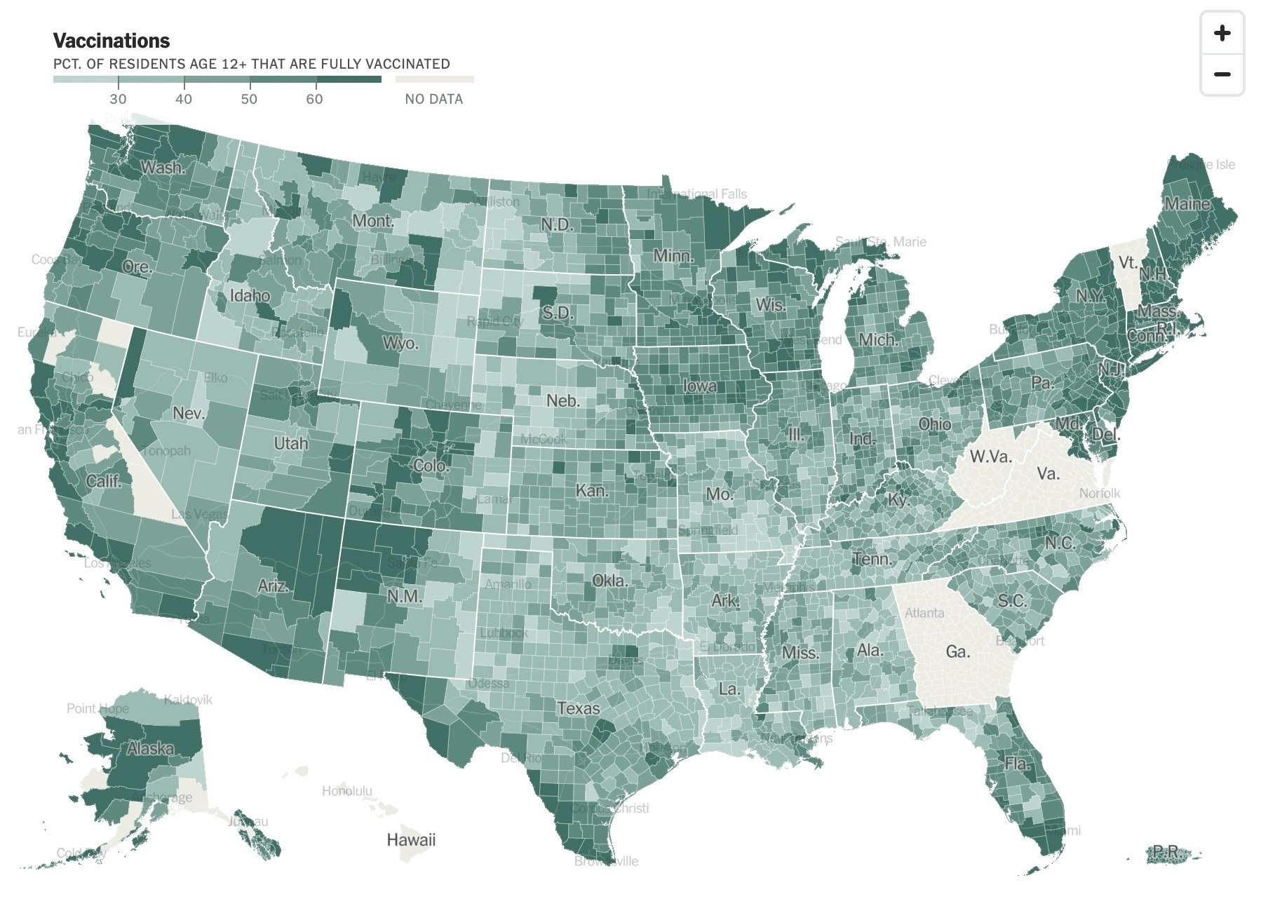
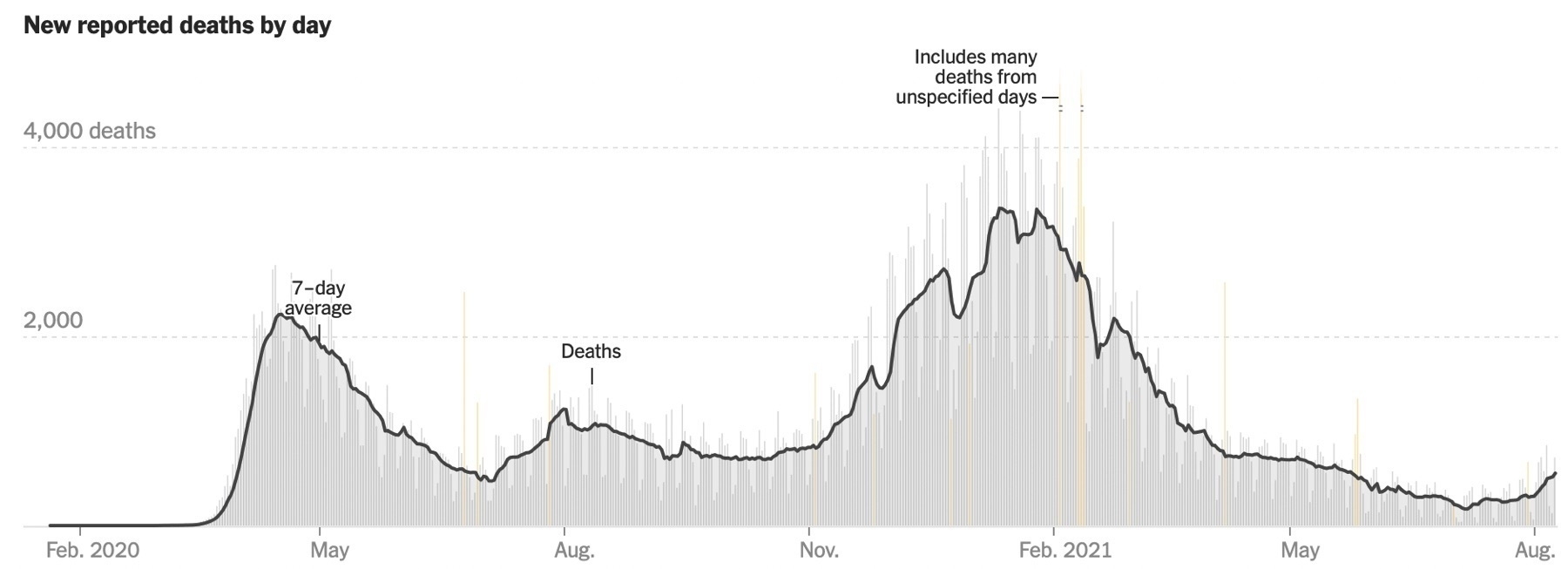
Updated COVID-19 graphs from today’s New York Times. The case count in Florida is pretty stunning. Minnesota is doing well. The best news is the continued low death rate.

Writer of the Weekly Thing. Blogger. Explorer of tech, the open web, AI, and a good escape room. Maybe a podcast? CTO of SPS Commerce, Board Member of MnTech, Former Board Member Minnestar. Minneapolis is home.
Updated COVID-19 graphs from today’s New York Times. The case count in Florida is pretty stunning. Minnesota is doing well. The best news is the continued low death rate.