
Ridiculous Web Surveys
It amazes me when I actually attempt to take a survey on the web how poorly designed they are. Most of the time I disregard them, but sometimes a product that I like runs a survey and I would like to offer my feedback. I got one of those recently and on the third page, which by the way is already two pages too long, they present this screen. The question being asked is, in essence, “what one feature do you most wish the product had?”
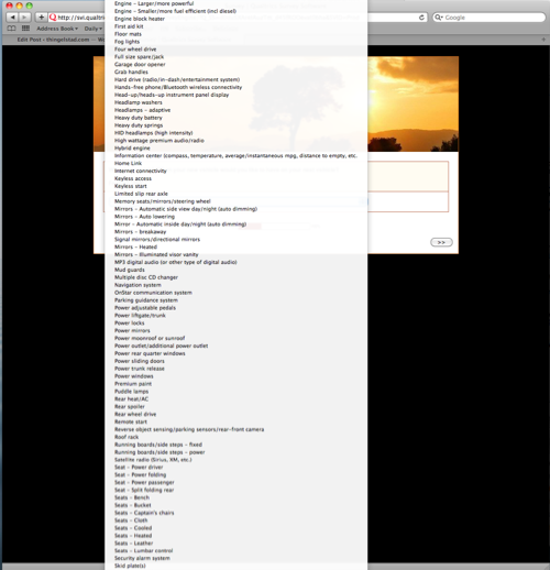
To answer this they provide a list that is so long that it expands over the entire browser. In fact, that screen shot only shows about half of the options available. On a 30" monitor I could not get all the options on the screen at one time. Ridiculous. Dumb. Failure.
At that point, I give up on the survey, and decide it is more fun to write this article. Sorry Strategic Vision, no feedback from me.