
The Typographic Desk Reference
A couple of weeks ago I was reading one of my favorite typography websites, I Love Typography, and saw their article about Theodore Rosendorf’s The Typographic Desk Reference. I was intrigued right away.
In recent years I’ve become much more interested in typography. In fact, on my own website I always push for layouts that focus on typography over graphics. I’ve been practically giddy recently when discussing the potential of @font-face in web design with Garrick Van Buren (stay tuned to his Kernest project by the way). I’m not a student of type, as I’m not a student of art. However, that doesn’t keep me from admiring beautiful type and appreciating the subtle elegance of a great type.
The Typographic Desk Reference looked interesting to me as a way to understand the terms and anatomy of type and it delivers wonderfully. This is a great book if you want to cut to the chase and get familiar with terminology and style quickly. Rosendorf has put together a very useful book. Here is an example of the depth offered in this book. You probably assume you know what a serif font is, well…
serif A small stroke at the end of an arm, stem, or tail of a character. Serifs are either reflexive or transitive. Reflexive strokes are either unilateral or bilateral. Additionally, reflexive strokes can be abrupt, or adnate. Typically unilateral, transitive serifs - as with italics - flow smoothly out of the main stroke.
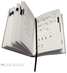
Additionally, I have to comment that this book was obviously put together with amazing care and thought. The placement of information, the structure of it, the binding, the paper and of course the type were chosen with care. Flipping through the pages reminded me of the obsessive focus that Tufte must put into his books. The effort is recognized and appreciated.
If you like type, I recommend this book. While your at it, how about ordering it straight from the publisher Oak Knoll, rather than Amazon.